Turn your boring wardrobe into a canvas for Color! – Heather Hertziger

12 03 2009

Color can be very scary for some people. Look at your closet right now, how much of it is black, gray, beige, brown, and white? Are you a color-phobe? I’m not here to scold you or try to talk you out of your fear of color. I am here to tell you that it is OK, and you are not alone. I am here to show you how to disguise your color phobia with three easy pieces.

Outfits with the popular 3/4 length sleeves scream for fabulous bracelets. A brightly colored bracelet not only hides the fact that your clothing color scheme is subdued. If you want to draw attention to yourself a cha-cha bracelet that swings and make noise is an excellent choice, the shorter 3/4 length sleeves seem made for this sort of bracelet as your sleeve will not get caught in the dangles. If you prefer your jewelry to be of the silent type a simple strung bracelet of brightly colored beads is an excellent choice. And if you prefer classic and simple then check out chainmaille. Metal is always a good choice but chainmaille adds an artists touch as well and shows that you are not the type to follow the herd when it comes to choosing jewelry.

pinksetbracelet1byz1
tiger11

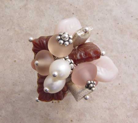
Tops with low necklines scream for a fabulous necklace. Bold necklaces draw attention away from your clothing and to your lovely face. Depending on how chunky you like your jewelry to be you have a lot of options. Many artists make fabulous chunky pendants that look great suspended from a simple cord. Strung necklaces with or without pendants are great too. You can combine various materials with different textures to make pieces not only interesting to look at but interesting to touch and fun to wear.

 purplefantasynecklace1 trianglependant
chaosnecklace22
  If your top has full length sleeves or a neckline that doesn’t work well with a necklace then a funky pair of earrings may be just the ticket. Earrings are always fabulous and there are literally 1000’s of designs and styles to choose from. If you are hesitant to wear a really bold necklace or just don’t care for bracelets then earrings are your best friend. If you’ve never worn bold jewelry before then earrings are also the easiest way to start. Without spending to much money you can find yourself a fabulous pair of fun and funky earrings just perfect for you.

blueet2 red31
pinkbrio2

So, take these tips, and turn your colorless wardrobe into a marvelous canvas on which to display some beautiful artisan jewelry. Whether you buy your jewelry from me, one of the other artisans on this blog, or from an artisan you come across at an art show, wearing a piece of colorful, beautiful handmade jewelry tells those around you “I am fabulous, and I deserve fabulous, colorful things.”

See, I told you a neutral wardrobe wasn’t a bad thing. 🙂

Heather blogs from her home in Watertown, WI. You can find her work on her website, Artfire, Etsy, and 1000 Markets.  You can read her personal blog here.


Conflict of Color – Andrea Quenneville

27 06 2008
Orange Tithonia

Since I was young, I have loved loud, vibrant colors. I imagine that I took my cues from the flower-topped weeds lining the dirt road I grew up on or from the marigolds my mother planted every year. I used to wear some outlandish outfits in middle school when all the “hot” hues were in style, but as I’ve gotten older, my love of bright colors has learned to compromise with other aspects of my personality and with my husband’s preference for neutral, earthy hues. When I look around our home, I see comfort and simplicity, but there are few hints revealing that my favorite color is orange. I am struggling to find a way to blend desert hues with those of pine-topped seaside cliffs and the fields of wildflowers that I love. Mother Nature does it effortlessly, but I am not so lucky.

Choosing fabrics for new projects is one area where my love of color escapes and freely explores the possibilities. I can spends hours in a quilt shop finding coordinates to perfectly compliment one another. I tend to downplay a bright print with a conservative one, but I often put gorgeous fabrics back on the shelf because I am conflicted about combinations. When I see a new collection, I am sometimes saddened that the conservative mom in me trumps my artistic side’s desire to use the wild and gaudy prints. For now, I am imagining ways to inject color into the ‘house of dreams’ we hope to buy later this year, while I work away in my little office surrounded by stacks of fabric that remind me of Mother Nature’s grace and unlimited palette.

Please visit Andrea’s blog at http://thoughtsfrommsq.blogspot.com .


Color Me All Over the Place — Lisa Liddy

10 06 2008

When it comes to choosing colors for jewelry, I admit it—I am all over the place. I buy beads and pearls and other supplies in the colors that I like first. Then I look around at what is HOT for the season (might seem a backward approach but I get where I need to be eventually). Usually there is some overlap (always a good thing!). And I’m always looking at the classics and neutrals.

If I’m wearing it this summer, it’s likely to be fuschia, orange, hot pink and black. Somehow my summer casual wardrobe (6 months of wear in AZ!) ended up in those color combos. I call it “accidental coordination”. My sub-conscious knew more than I did when I was out looking for clothes! This bracelet is actually my daughter’s but if she doesn’t start wearing it soon, I’ll reclaim it!

I’m a sucker for black and white in jewelry, too. It always sells and no one seems to think you can have too many pieces in that color scheme! And I’ve also gotten hooked on pale pink and brown like in this ring. I call these “Sex and the City” colors!

As I’ve gotten more years behind me in the business, I’ve tended to avoid most holiday, seasonal colors (with the exception of a very few red, green, and white pieces) in favor of more marketable year-round colors. And in the “rules are made to be broken” category, I’m working on a red, white, blue bracelet—but that is really more for another blogging project than to sell. I have some great ideas in holiday color schemes, but I find my style of jewelry doesn’t sell easily when wearing time is limited.

All shades of purple appeal to me and to my buyers. It’s such a comforting color palette for me too. When I am having a creative drought, I pull out my purple stash and start to relax and let things flow.

Another combination that always makes me feel good are “watermelon” shades: pinks, greens, reds… Especially for summer but I make Melonhead Joolz year-round thanks to generous beadmaker friends.

Eventually, I’m going to get my office repainted in soothing shades of teal and mauvey plum. I have had the paint chips picked out for a year but if you’ve been in my office, you’d know what an ordeal it will be to paint.

I told you I’m all over the place with colors! I’ve thought about sorting all my handmade glass beads by color, but I’m half afraid where I saw “gaps” in the color wheel, I’d feel the need to fill in and that would be a bad thing!

I really can’t imagine life without all the colors of the rainbow in beads!

www.joolzbylisa.com     www.lisaliddy.wordpress.com


Colour – Annette Piper

15 03 2008

Colour can have such an effect on the way we feel that it is an integral part of the jewellery designer’s process.   We must consider not just the beauty of the components, their patterns and their wearability, but how they will look when in the finished piece – are the colours harmonious, will it flatter most skin tones or only a few?  Will it have to be worn over clothing to get the best impact or is it best worn against the skin?  Will the majority of your customers be able to wear such a colour? 

I love greens and yellows – to the point of where I really buy more of these coloured gemstones than I can in reality use.    Yellow is a colour that, for the most part, looks better on those with olive skin, or at the very least, someone with no ruddiness.  Yet I live in a location with a high density of fair Caucasians and I myself have fair skin with a slightly ruddy cast.  Citrine and lemon topaz look awful on me if worn against my skin, but I can get away with a little if I put such stones with some rich browns and deep reds.    

Greens have some of the same problems, but the different shades of green mean that most people can wear some version of green well and there are a wonderful array of green gemstones that are available.  Of course, just to be difficult, I personally love the yellow- greens (such as peridot) which, once again, looks awful on me unless it is surrounded with other stones or given a border of gold or silver. 

Everyone, it seems, loves blue and it tends to look very good on a high proportion of people.  Naturally, blue is one of the most difficult colours to obtain in gemstones.   Sapphire of course is the best known blue gemstone, but at a substantial cost.   Likewise, other costly varieties include blue diamonds, blue topaz, aquamarine, spinel, zircon, tourmaline, and so on.   More affordable blues are found with iolite, kyanite, turquoise, blue lace agate, blue chalcedony, lapis lazuli, sodalite …. but the vivid, desirable blues in less costly stones are still difficult to find. 

I am often asked for jewellery made with red stones.  I show these people the deep reds of garnet and orange-reds such as found in coral and carnelian, but no, they want bright, fire-engine red.   I usually have to tone down their expectations at this point of getting affordable gemstone jewellery in this colour.     At least with reds most people can wear them –  albeit with limitations (with either the cool reds (blue-red) or the warm reds (orange-red) being suitable ).   

I have the added limitation with my jewellery that those that make their own beads don’t have – unless I go to treated stones, I am limited to what nature provides.  If I can get people to look beyond their immediate desire for a particular shade, however, they soon learn the delights that can be afforded by looking deeper into gemstones and the value of something natural and unique. 

Lemon Citrine Necklace by Annette Piper Dip. Gem. Handcrafted Jewellery

A beautiful lemon citrine necklace, but a hard colour for some skin types to wear .

www.collectivecreatives.com

www.annettepiper.com


Color – Kendra Sanders

3 01 2008

I love color! I must admit, though, that it’s a new found love. And so, I am just beginning to explore the fascinating world of unexpected color combinations. But boy am I ever making up for lost time.

As a “forty-something” I am learning to look at the world through eyes that aren’t quite as traditional as they used to be. I grew up in the “Preppy 80’s” and grew to really love wearing all the cute grosgrain accessories in bright tropical stripes. Pink and green ruled the day. But as I grew older and entered the corporate world, navy blue and black took a stronghold on my sense of fashion, and from there seemed to infiltrate my entire personal style. Everything from choosing a car to home decorating. I thought it was a real stretch when I chose to decorate my living room in a cottage style, with denim sofas and yellow and rose accent pieces. Oh yea, now that’s going out on a limb.

Then one day, I woke up and felt the need to totally and completely revamp. Literally. I woke up and looked around and wanted color everywhere. I started in my living room. I found the most intense red sofas, a gorgeous area rug that sings with bold reds and greens and blues and golds. A huge sofa painting that reflects that same scheme. And curtains that are piece worked sheer organza in fabulous jewel tones, reminiscent of contemporary stained glass art. All the accessories are bright, bold and funky. I love this room. It’s me. Well, at least it’s who I am today. Ten years ago, I would have been very hesitant to throw myself into a design with so much intense color.

Whatever it is that has turned me on to the incredibly rich world of color has also affected my glass bead designs. Just recently I spent a few days working under a personal challenge. The challenge was this: To make beads, each with at least 5 different colors, no white, and combinations that I wouldn’t normally work with. Orange and aqua. Teal and periwinkle. Raspberry and spring green. I had a blast working on these beads and the results far exceeded my expectations. What started as an experiment in color has now become an addiction. Each time I sit at the torch I am just aching to come up with some new combination that really clicks.

I had been in a real rut as far as my bead making was concerned. This little exercise really helped me see some new and exciting possibilities. Now, I have a new energy and a real excitement, even a sense that I’ve reached the “next level” in my skill development. That’s very exciting to me, because as I look back on my journey in the lampwork world, I can recall milestones where my work would take on a new look or a new personal meaning. I definitely think this is one of those markers in time.

Kendra


Color – Kendra Sanders

3 12 2007

So much of the fun I have with creating glass beads is playing with color.  Not being an art student, the idea of “Color Theory” was new to me.  Well, not so much the concept, but the vocabulary.  It seems I have always had “an eye” for color and design, I just didn’t know how to describe what I was visualizing.  Sure, everyone knows about Primary and Secondary Colors, but then there are Tertiary Colors, Complementary Colors, Analogous Colors.   I’ve spent some time familiarizing myself with the concepts involved in Color Theory and have really had a lot of fun conceptualizing new color schemes, yet I still seem to be a bit “color challenged”. 


Playing with color combinations is much like trying to put a puzzle together.  You lay out the pieces that you are going to work with, sort them according to their “fit”, and then begin the process of working through the project.  Because glass is a reactive medium, trial and error is the name of the game.  Sometimes colors that look good on your work bench don’t play well together in a finished piece.  How distressing.  But when a new combination really works, the sense of accomplishment is incredible.  For me, those moments of victory are few and far between, so I tend to look outward for ideas.


When I find myself in need of inspiration for new colors or designs, I tend to look toward home decorating and fashion trends.  Two of my favorites to draw from are Waverly and Vera Bradley.  These two giants in the textile industry have developed a style and palette that is easily recognizable.  Their patterns, with generous use of florals, paisleys, round motifs and dots, lend themselves well to hot glass work.   


With the recent rise in popularity of the Vera Bradley handbag line, it is only natural that artists would be styling their work based on these color schemes.  The colors are fun and fresh, while the designs are challenging to recreate. I have seen several lampworkers comment that their designs were directly inspired by a Vera Bradley handbag.  I will admit as well that I have created sets of beads to match my own bags and created coordinating jewelry. 


Waverly tends to be a bit more classic and tailored.  Their color schemes are more rich and traditional.  Classic stripes, cheerful checks, playful plaids, lush florals are the signature of Waverly.  And they are all created to be tastefully mixed and matched within a particular palette.  This is where I look for ideas for an eclectic mix of beads, especially if I’m not up to making a set of perfectly matched beads.  A set created with dotted beads, encased florals, stripes and textures may very well have been inspired by a sample room on the Waverly website.


If like me, you are a bit challenged by the process of finding new and intriguing color combinations or patterns to work from, I encourage you to spend some time looking through the pages and sites of textile designers.  I go so far as to save photos and magazine pages for future reference.   The same thing can be done through the internet and saved to a folder on your computer.   Some sites even offer an opportunity to design entire rooms, from paint to wallpaper to fabric choices.  It’s fun to play and dream.  And a great way to rev up your own creativity for other projects.


Kendra


Color – Deanna Chase

23 11 2007

Why are we drawn to work with certain colors?  Almost always, when I sit down to work, I think to use the color blue.  It never fails.  My first choice is always blue.  I think I would make every bead in blue if I thought I could sell them all.  I wonder if there is something to the meaning of colors.

Blue is said to represent the sky and sea. It is often associated with depth and stability. It symbolizes trust, loyalty, wisdom, confidence, intelligence, faith, truth, and heaven.  Blue is considered beneficial to the mind and body. It slows human metabolism and produces a calming effect. Blue is strongly associated with tranquility and calmness. In heraldry, blue is used to symbolize piety and sincerity. Taken from Color Wheel Pro

There could be something to that.  I remember last time Greg and I went to the coast.  It was in South Carolina, as we headed out to Hilton Head Island.  I told him as we crossed the bridges, I just feel more peaceful every time I look at the ocean.  The calmness just takes over.  I never want to leave.  Above all I treasure tranquility and calmness.  One of my favorite sayings is “I just don’t do drama.”  I crave peacefulness.   

Does this mean that when I do choose to work in another color, I am feeling different?  Lets talk about red.  I like red.  I even wear red quite a lot.  But I don’t usually choose to work with it.  Every once in a while, I pick up red and run with it, but blue is still almost always my first choice.Red is the color of fire and blood, so it is associated with energy, war, danger, strength, power, determination as well as passion, desire, and love.  Red is a very emotionally intense color.

Red seems almost the exact opposite of blue doesn’t it?  Blue definitely fits my personality better in my opinion.  I would not call myself an intense person.  So maybe there is something to the meaning of color and why we work with them.  The other explanation could be I wear blue jeans almost daily, so blue would match almost everything I wear.

Deanna

Chase Designs 


Color by Lori Anderson Designs

17 10 2007

Color is the stuff that attracts the eye.  it evokes emotions, stops you in your tracks and perks you up on a bad day. As a jewelry designer, I work with color every day, whether it’s in actually creating a piece, setting up my craft show booth, or shopping for more beads.   It’s one of the perks of the job!


I’m often asked how I store my beads, and after several different experiments,  by color is how I do it.  I have a huge cabinet, and each drawer in the top section has a specific color ,usually two drawers per color.  In the bottom section, I have a more random, eclectic assortment of beads.  Here I have gemstones stored by color family, all the warm metals such ascopper, bronze and brass living together. There area also a few drawers that are just a riot of mixed colors.  Those unruly drawers are filled with vintage lucite and all manners of Czech glass mixes that I create for cha-cha necklaces and fun, out of the box pieces.


I’m also asked how I come up with color combinations for my jewelry.  One of the ways is by keeping a Color Inspiration Notebook. This is a photo album full of clippings of dresses from Vogue, flower bouquets from the garden, paint swatches from Lowes.  I’ve even been known to see an outfit in Gymboree and scribble down “pink, brown, hint of lime” on a scrap of paper and stick it in The Notebook.   Another way is by choosing my colors and piling the bags of beads on my work table, and then shuffling them all around to see what sticks.  Often, there’s another bag of beads on the table that I forgot to put away from a different project, and those beads add just the extra oomph I was looking for.  Accidents in the creative process are good! When working with color, go with your gut.  Reach for what speaks to you.  Throw in a discordant color into the mix to see what happens.  Look at everything around you as a huge paint box.  Experiment with how you store your beads, paints and papers.  Before long, you’ll have more ideas than you’ll know what to do with!